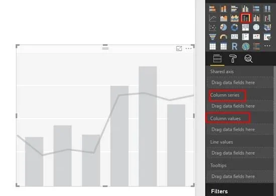
Include more than one measure/column in ‘Column values’ of Power BI stacked column chart and slice each measure on its ‘Column series’.

Scenario
- We have multiple measures in different tables: Measure1, Measure2, Measure3
- Each measure slices on a status of its own
- Measure1: Active, Inactive
- Measure2: Current, Default
- Measure2: Blocked, In Progress
- Now, we want to show Measure1, Measure2, Measure3 as stacked bar chart. And each measure should get sliced by its individual status.
In this scenario, we will have maximum 6 color stack and each color corresponds to an unique status.
Solution
- Union All different measures in a single column in database, and assign a unique key to each measure.
- If a measure has its own series, then retain that key and make sure it is not conflicting with other measure series keys
- If a measure does not have its own series, assign a key to it which is unique to the measure
- Create a table which contains the key of each measure and its corresponding text values.
- Create a relationship between the above two tables in Power BI or tabular model or MOLAP on the key.
- Drag the measure created in step 1 in ‘Column values’ and drag the text column created in step 2 table in ‘Column series’
Note: This solution can be used for any clustered or stacked visual. E.g. Clustered bar chart, Stacked bar chart, Line and stacked column chart, etc.
Output

In the above image, highlighted rectangular section depicts series for each measure combined in a single chart.
Advantages
- When need arises to compare more than one measures contribution in a single chart.
- Reducing the number of charts in the report.

